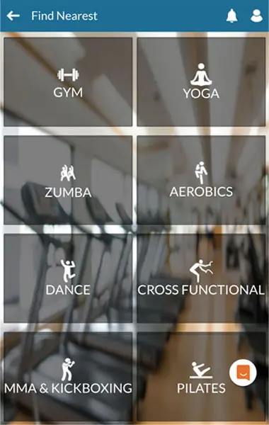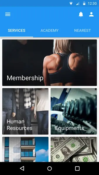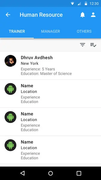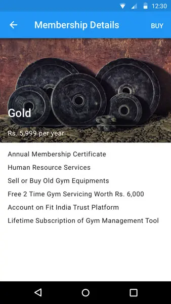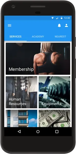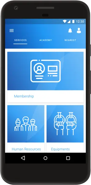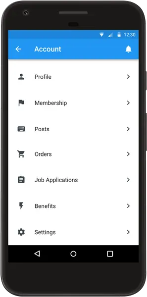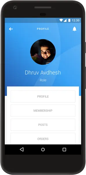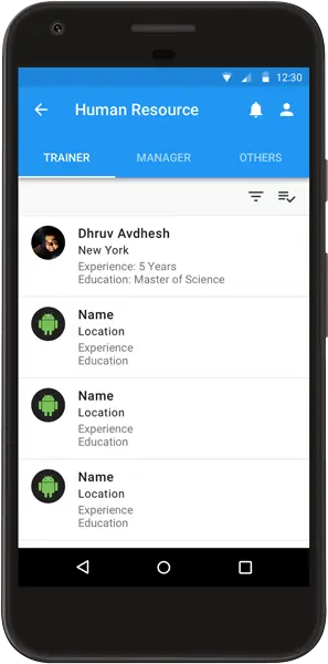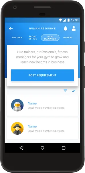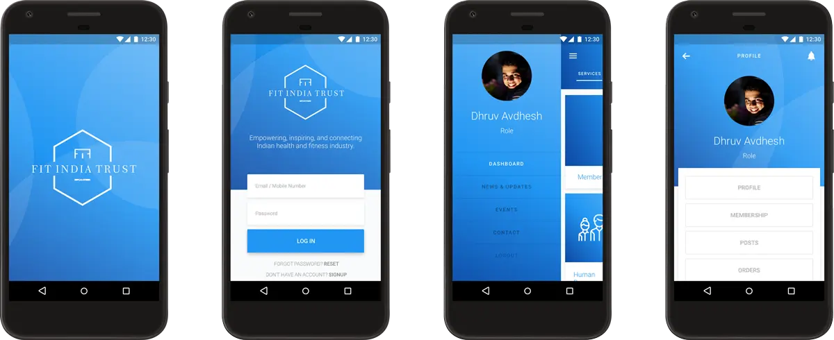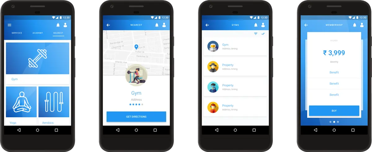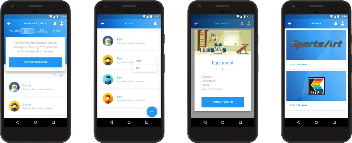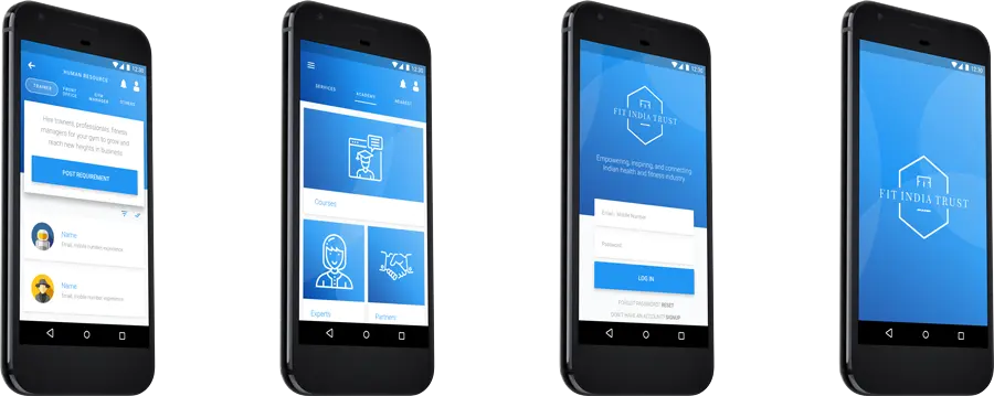
Fit India Trust works at the helm of the health and fitness industry in India to empower, inspire, and connect various stakeholders including but not limited to owners, professionals, and enthusiasts. They had created a basic functional Android application as a minimum viable product and later reached out to me to revamp the user experience and user interface of their mobile application to increase their customer base and user retention on their platform, while continuously strengthening their in-house products and services.
Design a usable, more communicative, and emotional user interface for Fit India Trust's Android-based mobile application to enhance the user's experience. The new design should make the app easy to use, should be innovative and aesthetically pleasant, and should go down to the last detail.
My responsibilities included pursuing a mobile-first approach to design the new Fit India Trust mobile application after conducting user research of three main user types - owners, professionals, and enthusiasts; and subsequently guiding and supporting their Android app developer in implementing the design.
Age: 22 - 36 years old
Occupation: Gym owners, fitness professionals (trainers, managers, receptionists), and enthusiasts
Location: National Capital Region (Delhi, Noida, Gurugram, Ghaziabad, Faridabad), India
Needs:
- Human resources for managing and maintaining gyms.
- Support for setting up new gyms including buying new branded equipment.
Motivations:
- Certification in fitness will help boost career goals.
- Access to trustworthy professionals and partners in the fitness industry.
Desires:
- Connect with fellow users who might be selling used equipment.
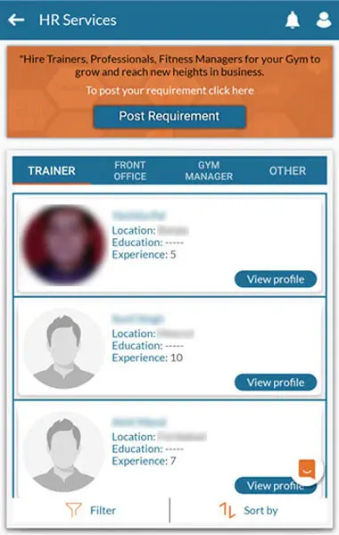
- A dedicated job portal for jobs in the fitness industry.
Frustrations:
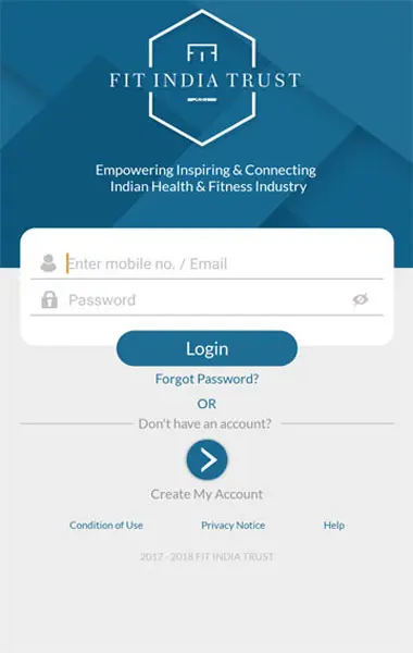
- One time password, for mobile number verification, never arrived even after too many tries.
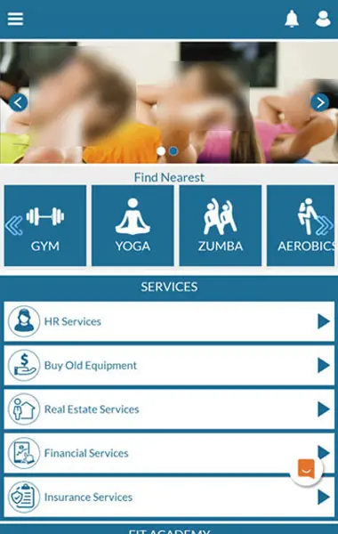
- Extremely poor navigation and unappealing design. Resources seem to be scattered in random places.
| Referral | One-Time Password | Dashboard | Navigation | App Crash | Service | Listing | Action |
|---|---|---|---|---|---|---|---|
| Download the mobile app and signup. | Verify mobile number through a one-time password which doesn't arrive even after a few tries. | Look for the primary resource due to which the signup happened. | Figure out a way to get to the appropriate resource. | Login to the app again and resume from where the app crashed. | Land on a particular resource after brief glances at featured resources. | Browse through the available listings for a particular resource. | Get in touch with the service provider or buy the product. |
| 😀 | 😐 | 😞 | 😒 | 😖 | 😟 | 😐 | 😊 |
| Pain Points | Goals | |
|---|---|---|
| 1. | Extremely high cognitive load due to cluttering. | Declutter the application so that the user can focus on things that interest them. |
| 2. | Different layouts for different screens. | Follow a consistent design system throughout the application. |
| 3. | Visual hierarchy is missing. | Use visual weight to convey importance. |
| 4. | Navigation and notifications are complex. | Simplify the menus to not make the user think. |
| 5. | Poor utilization of the screen space. | Spread out the content across the viewport and increase white spaces. |
| 6. | Call to actions are not emphasized enough. | Make the call to actions prominent by making them stand out from the rest of the elements. |
| 7. | Touch targets are small. | Make the touch targets at least 10mm in linear dimension. |
| 8. | Programming problems such as application crashes. | Reach out to the developer to fix these issues. |
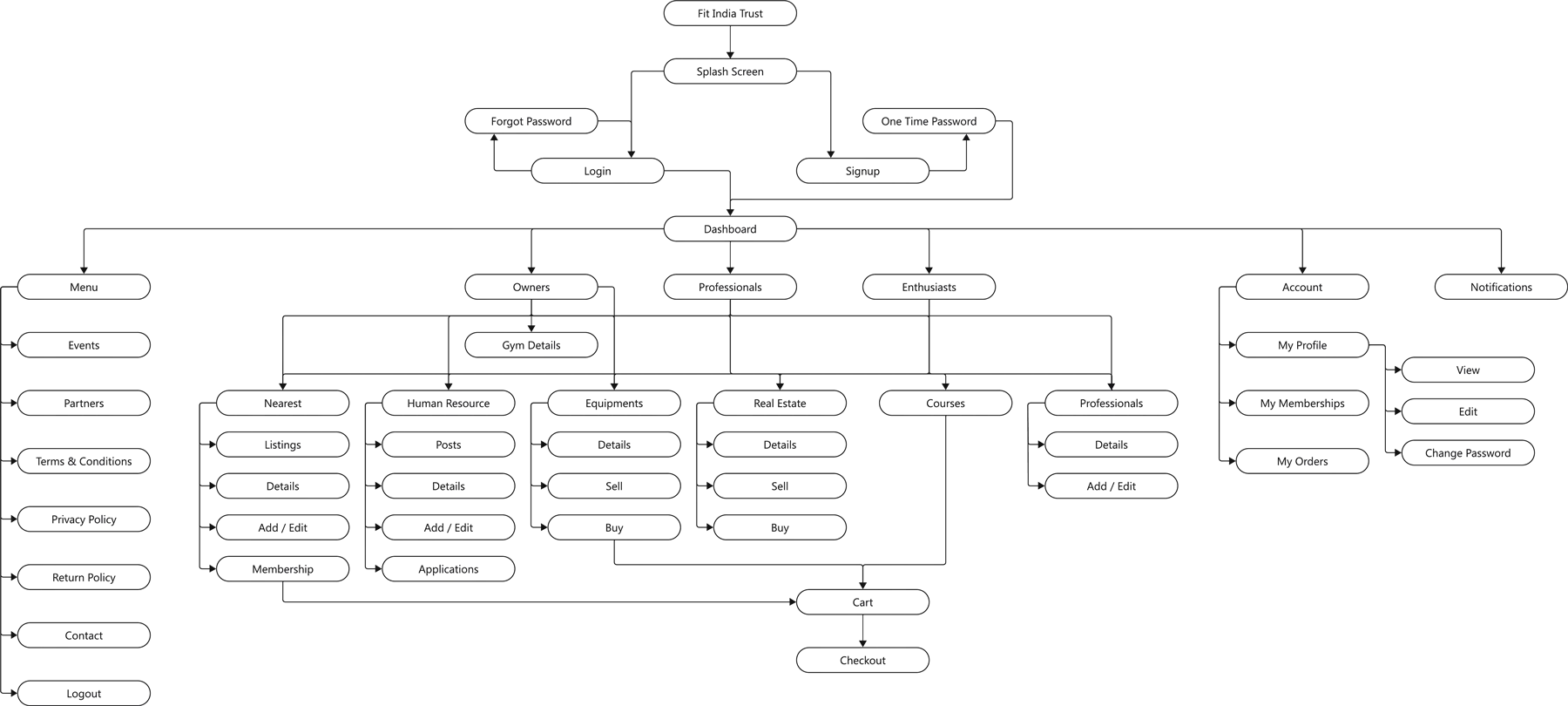

Here are the main issues found in usability or user testing:
- Even though the prototype looks better than the existing application, it is not something very unique or appealing.
- The swipe-based onboarding process is ineffective and too long. It should be cut down and a skip button should be added.
- The buttons or call to actions on the top right corners camouflage with the bar on the top.
- There is a slight mismatch between the design language used on some screens.
- Some key interactions either have been left out or are missing.
- The screen space can be more efficiently used in some cases.
Decluttering the Dashboard
The time it takes to make a decision increases with the number and complexity of choices available.
Simplifying the Navigation
The average person can keep only 7 (±2) items in their working memory.
Accessible Design
- Making touch targets at least 48 × 48 px in size.
- Maintaining a color contrast ratio of 3:1 at the minimum.
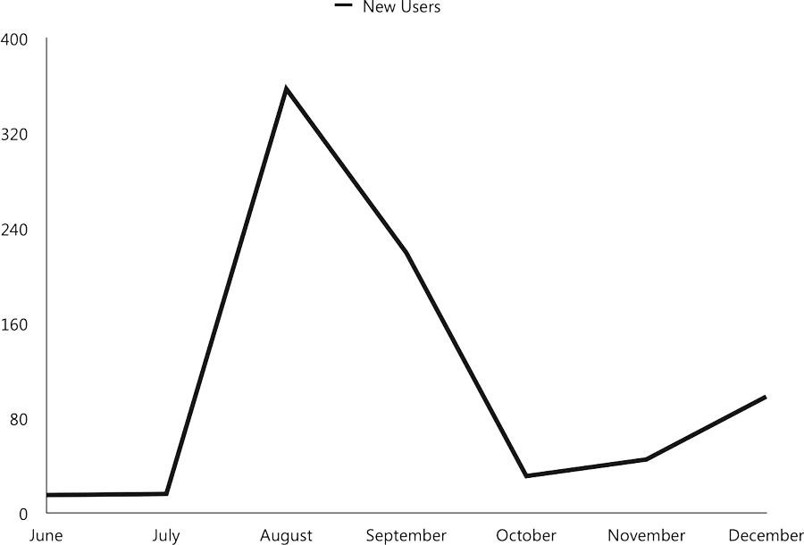
The key performance indicator used for this project is the number of new unique user acquisitions, on a month-to-month basis, as reported by Google Play.
